FLASH SALE Get 10% OFF everything using the coupon code: FLASH10 View Pricing Plans →
This tutorial will help you understand how images are handled and cropped in themes with full-width (not fullscreen) sliders on front page:
Capital
Diamond
Energy
Insight
Medicus
Modena
Seasons
Venture
VideoBox
While full-width sliders look good on any website, there are some things you should consider before deciding which kind of images to use in them in order to avoid important areas to be cut.
We’re using a CSS technique called background-size: cover, because this is the easiest way to fill a full-width slider with an image.
Here you can see more details and demo of this CSS property:
Background size demo
Background size demo 2
In order to explain things easier, we’ll provide an example.
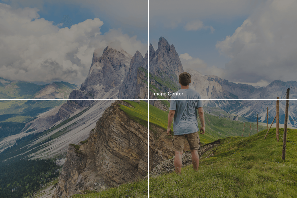
Let’s take the following image in landscape orientation and insert it in a full-width slider:

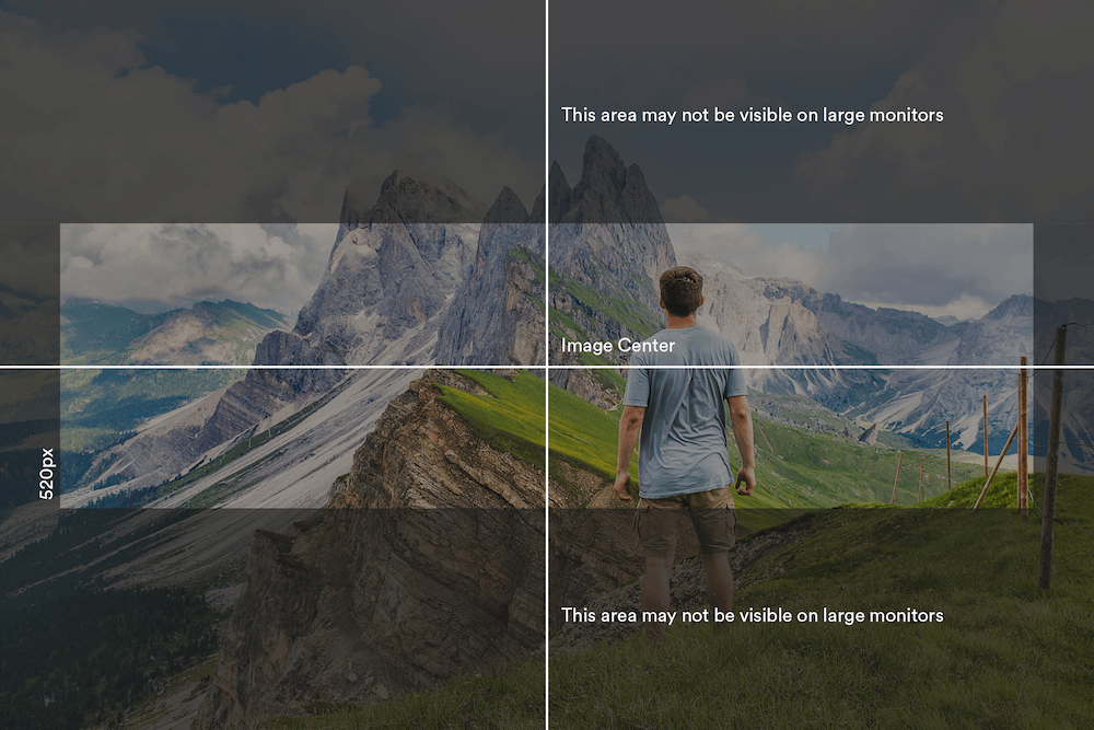
Since most of the full-width slider have a fixed height of about 500-600px, it’s hard to keep entire image visible, so some of its areas will be cut from the edges to the center:
Shown above is the slider from Venture theme with a fixed height of 520px on large monitors.
As you can notice, the slider tries to fill entire area with the image, without affecting its original aspect ratio.
Demo:
You can see this in action on the following link.
Be sure to resize the window to see how the image will change on different resolutions.
As can be noticed from the example above, on larger monitors the image will be cut the most. This happens usually on larger than 2000px wide monitors.
Wondering why? Because the original image has the size 2000x1333px, while the slider on a 2000px wide monitor has the height of 520px:

We highly recommend you to upload large images in your sliders, and don’t crop them to match your slider height. Any image with the minimum size of 2000x1300px will be displayed fine across all devices.
✖ Don’t use portrait-oriented images.
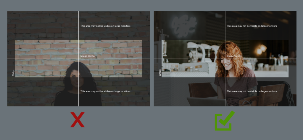
✖ Don’t use images in which the focus area is not located at the center (at least vertically):

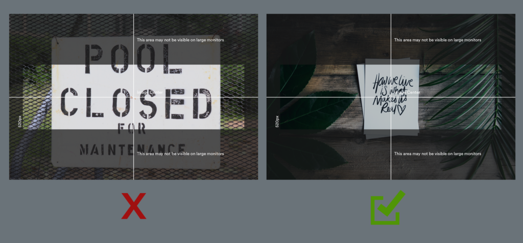
✖ Don’t use images with large typography at all, or make sure that the text is small and located at the center:
